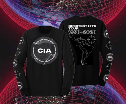
Sorry, Kanye has nothing to do with that terrible CIA redesign

If you need a reminder that any Instagrammable, minimalist digital media aesthetic can be co-opted by the worst people in the world at any moment, look no further than the CIA’s newest web redesign. When it debuted on Monday, the Company’s new-look site was widely lampooned as a desperate appeal to young, diverse audiences that brought the “hire more women guards” meme to life.
As CIA director Gina Haspel told the Associated Press, the site redesign is part of a way to showcase the agency’s progress and dynamism over the past few decades:
“We’ve come a long way since I applied by simply mailing a letter marked ‘CIA, Washington, D.C.,’” said CIA Director Gina Haspel, who joined the agency in 1985. She said in a statement that she hopes the new website piques the interest of talented Americans and gives them a sense of the “dynamic environment that awaits them here.”
The reliable joke formats wrote themselves. Take your pick as to whether the logo recalled Joy Division, some buzzy electronic act you missed at Boiler Room, or hey, one of Mic’s sister sites. But the resemblance was perhaps most striking to the Intercept, one of the websites best known for keeping powerful agencies like the CIA in check.
On Tuesday, Ryder Ripps, the controversial graphic designer who’s collaborated with Kanye West, Grimes, and Pusha T, among others, claimed he was behind the CIA relaunch. On one of his public Instagram accounts, ig.portfolio, he sparred in the comments with users who questioned his work for the agency that routinely aids coups, mass-murder campaigns, and international instability. When someone told Ripps these fonts will be used to justify atrocities, he responded the fonts “are used by the Intercept, it’s clearly a troll.”
On his Twitter account, which is now locked to the public, Ripps got remarkably defensive about the choice with some galaxy-brained missives. “Thinking is not as fun as rock throwing”; “U know who’s helping the CIA the most? All the people tweeting about them.” It’s still on his Instagram portfolio, alongside the “Global Warming Is Good” billboard for Grimes, but takes on a more sheepish approach on Twitter where it’s reduced to… “photoshopping some pixels.”
As it turns out, the whole stunt by Ripps might be even more trollish than stealing the Intercept font. CIA spokesperson Nicole de Haay told Exclaim that Ripps wasn't involved in the site redesign:
"As CIA's new website states, we're looking for people from all backgrounds and walks of life to work at CIA, but this individual had absolutely nothing to do with our website redesign."
Taken together, it’s a deeply funny conclusion to the hypebeast-adjacent fixation on minimalism and sleek design. Pair the right web design with the right disregard for complicity in imperialism, and you get something like the flashy new-look CIA website. It’s harder to gauge who had the bigger misfire — whoever thought this would make for a fire new clip, or the agency that believed something so shameless could squeeze by without getting dragged by every corner of the internet.