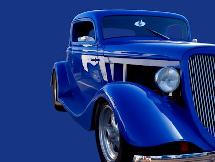
Pantone's color of the year paints a hopeful decade ahead

Every year since 2000, color kings Pantone have chosen a new hue to define the year. In this decade, there’s been the chaotic choice of “Emerald” (2012), and the seemingly permanent choice of “Rose Gold” (2016) which has plagued the graphic design elements of Instagram jewelry ads ever since. Sometimes, the color of the year doesn’t really have any impact — 2019’s pick was “Living Coral.” Not only are the reefs still dying, but the color didn’t really have a moment in design, or on red carpets and advertisements. “Living Coral” didn’t really catch the vibe.
But 2020 will be a bit different. The color that Pantone chose for the next decade is “Classic Blue.” Vanity Fair reported that the color was chosen because Pantone believes it is a “a reflective blue tone.”
“As technology continues to race ahead of the human ability to process it all, it is easy to understand why we gravitate to colors that are honest and offer the promise of protection,” Pantone said in a statement.
“Nonaggressive and easily relatable, the trusted Classic Blue lends itself to relaxed interaction. Associated with the return of another day, this universal favorite is comfortably embraced.”
That’s a lot to place on the shoulders of a single shade, but blue has been doing a lot of work for quite a while. There’s songs about being blue, plays about being blue, New York University even once had a whole major about blue. There’s also the ocean, and the sky. True to our time, the color is as much rooted in our nostalgia as it is filled with anticipation for the future. No other color, not “Rose Gold” or “Marsala” or “Serendipity” feels quite as applicable to the time.
Blue has been used to lure us into false sense of security on Twitter and Facebook, social media giants that have used shades of the color to create a sensation of peacefulness even as they mine our data and disrupt our democracy. But with the assurance of such a sincere and honest shade, maybe this year of “Classic Blue” can be a reclamation of the color, and therefore the concept behind it.
“Classic Blue encourages us to look beyond the obvious to expand our thinking; challenging us to think more deeply, increase our perspective and open the flow of communication,” Pantone continued in their statement.
Whether you want to wear it, paint it, or just admire it, lets hope we can also bring the ethos of “Classic Blue” into the year. Lord knows we need it.