These weird hip-hop stamps might save the post office

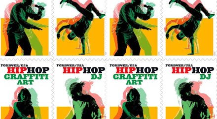
Finally, some good news for the cross-section of hip-hop and USPS fans: the post office is commemorating the genre with a new line of Forever stamps. The Postal Service has teamed up with the Bronx’s Universal Hip-Hop Museum to release a pane of 20 stamps that “features four elements of hip-hop: MCing (rapping), b-boying (break dancing), DJing and graffiti art.”
I’ll say it, the stamps look weird! Designed by art director Antonio Alcalá, reimagining photographs by Cade Martin, they’re cast in a vibrant yellow, green, red, and black color pattern. That much is fine, but they also look incredibly blurry in a way that doesn’t translate too well on a screen. As the press release explains it: “the bold, digitally tinted images on the stamps are intended to appear in motion.” Instead, it looks more like pulling the 3D glasses off your nose at a movie, or those color blindness tests that I struggle with at the eye doctor.
It’s been all hands on deck as of late to save the USPS, which hasn’t turned a profit since 2006 and has weathered multi-billion dollar losses every year thereafter. On a May episode of Last Week Tonight, John Oliver announced his custom line of stamps with Stamps.com to benefit the post office. Separately, there was something of a social media campaign back in April to buy up a ton of stamps to help slow the bleeding.
There’s always reason to be skeptical of snazzy branding moves, especially in the wake of calls for change much more significant than branding. But also: it’s the post office! The USPS is having a tough time of it right now and more or less fighting for its life, so they’re allowed to be corny. We don’t want to imagine a world without the post office, and independent artists in hip-hop and all other genres would suffer immensely if the government allows it to die. Nothing wrong with some cringe in service of the greater good.